Why High-Quality Printing Begins Long Before Ink Touches Paper — and How Technical Image Preparation Protects Every Job
In This Article
- 1Why Quality Begins Before Printing
- 2Why Image Correction Is Necessary
- 3Highlight & Shadow Alignment
- 4Density Control & Ink Limit Management
- 5Mid-Tone Adjustment & Dot Gain Compensation
- 6Colour Cast Removal
- 7Selective Colour Correction
- 8Hue, Saturation & Gamut Control
- 9Sharpness Optimisation
- 10Correction Across Printing Technologies
- 11Why This Matters for Publications & Events
- 12The Professional Difference
- 13Final Thought
Why Quality Begins Before Printing
Many people believe print quality depends mainly on the printer. In reality, most quality problems begin much earlier — at the image preparation stage.
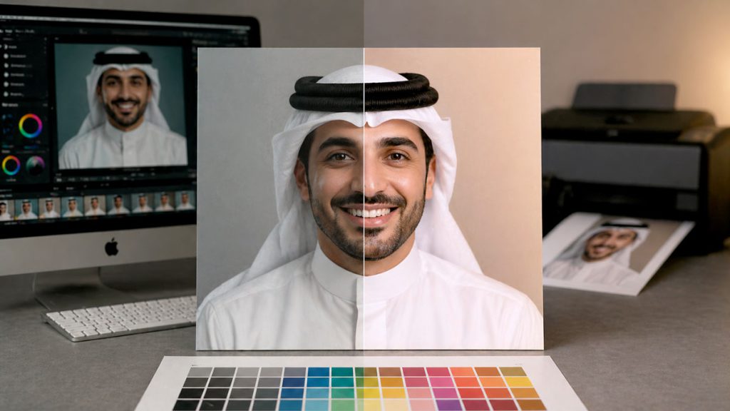
Before any job goes to press at Printec Solutions Co. WLL, professional image correction is applied to ensure:
- Natural, accurate colour reproduction across every image in the job
- Preserved highlight and shadow detail within the printable tonal range
- Controlled contrast that works with ink behaviour on the chosen substrate
- Neutral grey balance maintained consistently across all images
- Maximum clarity and sharpness appropriate to the output method
At Printec, image correction is not cosmetic editing. It is technical preparation — engineered to the physical reality of how ink behaves on real materials under production conditions.
Why Image Correction Is Necessary
In real production environments, images arrive from many different sources — each with its own technical profile, colour characteristics, and quality limitations.
Common Image Sources
Professional DSLR cameras, mobile phones, consumer cameras, scanned archive photographs, web downloads, stock libraries, and mixed client-provided file formats.
Variable Characteristics
Each source carries different colour profiles (sRGB, Adobe RGB, unknown), different dynamic range, compression artefacts, lighting inconsistencies, and exposure balance.
Without structured correction, printed results commonly show:
Unwanted Colour Casts
Yellow, green, or magenta tints that were invisible on screen become obvious and distracting in print — particularly in skin tones and neutral background areas.
Washed-Out Highlights
Bright areas clip to pure white, losing fine highlight detail in skies, product surfaces, and light fabric — detail that existed in the original file but was not protected.
Blocked Shadows
Dark areas collapse to solid black, eliminating texture and depth in shadow regions that should retain visible tonal variation in the final print.
Flat Mid-Tones
Mid-tone compression reduces contrast in the tonal range where most image information lives — making images look dull and lacking in visual presence.
Highlight & Shadow Alignment
One of the most critical — and most commonly neglected — stages of image preparation is aligning the tonal range of every image to the printable limits of the chosen output method.
Digital screens can display wide tonal ranges using emitted light. Printing uses ink — which has physical density limits at both ends of the scale. Without alignment:
Highlights Clip to Pure White
Detail in bright areas — clouds, product highlights, light fabric — is irreversibly lost when highlight values are not pulled back within the printable range before output.
Shadows Block to Solid Black
Dark areas fill to ink-solid black, losing all texture and depth. Shadow detail that existed in the file disappears permanently in the printed piece.
Printec performs highlight and shadow alignment on every image — preserving fine detail, opening shadow areas without introducing noise, maintaining smooth tonal transitions, and preventing clipped whites and crushed blacks throughout the full tonal range.
Density Control & Ink Limit Management
Every printing process has a maximum ink limit — the total percentage of ink coverage that can be applied to a given area of a given substrate before physical problems occur.
Exceeding this limit causes:
- Muddy, detail-less shadow areas where inks over-saturate
- Slow or uneven drying, causing set-off and marking on the following sheet
- Colour distortion as excess ink bleeds and shifts during the drying process
- Surface damage and smudging on coated substrates with high ink loads
Professional correction includes controlling black density, managing Total Area Coverage (TAC), adjusting tonal curves for specific print behaviour, and maintaining strong shadow contrast without overloading the ink system. This ensures depth without sacrificing detail or introducing production problems.
Mid-Tone Adjustment & Dot Gain Compensation
Most visual information in photographs exists in the mid-tones — the range of values between highlights and shadows. Mid-tones are also where dot gain has its strongest and most visible impact.
The Mid-Tone Problem
If mid-tone curves are not adjusted for the expected dot gain of the output method and substrate, skin tones shift in warmth or hue, textures flatten, gradients become uneven, and colours lose tonal separation.
The Printec Approach
Mid-tone tonal curves are adjusted to compensate for expected dot gain, maintain tonal separation across adjacent values, preserve visual clarity, and ensure consistent grey balance across the image.
Mid-tone control is one of the strongest single indicators of professional production quality. It is where amateur and professional printing diverge most clearly.
Colour Cast Removal
Colour cast occurs when an image carries an unintended overall tint that shifts the appearance of every colour within it. It is one of the most common and most visible image quality problems in print.
Common causes of colour cast include:
Yellow Cast
Mixed lighting, warm indoor light, or tungsten white balance applied incorrectly.
Green Cast
Scanner bias, fluorescent lighting, or incorrect device profile conversion.
Blue Cast
Daylight at colour temperature extremes, shade photography, or shadow areas in CMYK conversion.
Magenta/Red Cast
Improper RGB to CMYK conversion, incorrect ICC profile applied, or scanner warm bias.
Printec removes colour casts by evaluating neutral reference areas within the image, balancing CMY levels to remove the tint, adjusting grey neutrality across the tonal range, and correcting white balance at the point of CMYK conversion. The result is natural, accurate colour reproduction — images that look the way the subject actually appeared, not the way a device or process distorted it.
Selective Colour Correction
Not every correction should be applied globally to the entire image. Sometimes only specific colour ranges require adjustment — and applying global correction to solve a local problem creates new distortions elsewhere.
When Selective Correction Is Used
Brand colour within a photograph that has shifted from its correct value. Over-saturated background tones competing with the subject. Incorrect skin tone warmth in portraiture or corporate photography. Specific colour drift in shadow or highlight areas only.
What It Achieves
Targeted colour adjustments that fix the problem area without affecting the surrounding image. Brand colour refinement to print-correct values. Controlled saturation correction in specific hue ranges only. Fine tonal adjustments in defined colour fields.
Hue, Saturation & Gamut Control
Every printing method has a limited colour gamut — a defined range of colours it can physically reproduce. Highly saturated digital colours — vibrant blues, electric greens, neon tones — frequently exceed the printable limits of CMYK ink on paper.
If not controlled before output:
- Colours clip abruptly at the gamut boundary — saturation steps down suddenly rather than graduating smoothly
- Detail in highly saturated areas disappears as hue values compress together
- Logo colours shift unpredictably during CMYK conversion, undermining brand consistency
Printec applies structured gamut management — adjusting hue for tonal accuracy, bringing saturation within the printable gamut of the specific output method, aligning brightness for ink compatibility, and performing accurate colour mapping. This ensures colour integrity while respecting the physical limitations of print.
Sharpness Optimisation
Sharpening is the final stage of image preparation — and one where errors in either direction create visible print problems.
The Risk of Over-Sharpening
Halos around edges, artificial contrast, noise amplification, and harsh texture in smooth areas. These artefacts cannot be removed after printing — they are permanently committed to the sheet.
The Risk of Under-Sharpening
A soft, weak appearance with insufficient edge clarity. Fine detail — hair, fabric weave, type outlines, product edges — fails to print with the definition it deserves.
At Printec, sharpening is calibrated specifically to each job’s conditions — printing method, paper type, dot gain behaviour, viewing distance, and final output size. Sharpness is engineered for the final medium, not applied as a universal setting.
Correction Across Printing Technologies
Image preparation requirements vary significantly depending on the output method. A single image file cannot be used universally across all technologies without adaptation.
| Technology | Key Correction Requirements |
|---|---|
| Offset Printing | ✓Dot gain compensation · Ink density control · LPI-aligned sharpening · TAC management |
| Digital Toner Printing | ✓Grey build adjustment · Banding minimisation · Toner behaviour compensation · Highlight protection |
| Large-Format Inkjet | ✓Device-specific ICC profiling · Saturation control · Viewing-distance sharpness · Media absorption adjustment |
| UV Printing (Rigid) | ✓Ink sit-on-surface behaviour · High-density shadow control · Gamut adjustment for substrates |
| Fabric / Sublimation | ✓Fibre absorption compensation · Colour shift correction · Contrast boost for fabric viewing conditions |
Printec creates production-specific versions of images where necessary — so that each output method receives a file prepared precisely for its behaviour.
Why This Matters for Publications & Events
In high-value projects, images typically arrive from multiple different sources — different photographers, different cameras, different lighting conditions, different years. Without professional correction applied across the full body of imagery, the result is visually uneven.
Without professional image harmonisation, some images look rich and detailed, others look flat and faded — and the overall publication feels unbalanced and inconsistent. Professional correction harmonises all images into a cohesive visual result that presents the organisation at its best.
The Professional Difference
That difference is visible in every printed piece — in the richness of photography, the cleanliness of skin tones, the accuracy of brand colours, and the overall sense that the production was handled with precision.
Final Thought
High-quality printing begins before printing.
It begins with disciplined image correction.
At Printec Solutions Co. WLL, image quality is not left to the press to resolve. It is prepared, engineered, and controlled — so the final print reflects professionalism, clarity, and brand integrity on every page and every panel.
The press executes. The preparation determines the result.
Quality is engineered in.
Ready to Elevate Your Brand’s Print Quality?
Every job at Printec goes through a structured image preparation workflow before a single sheet prints. Don’t settle for output that could have been better.
Partner with Printec Solutions Co. WLL for printing that delivers:
Accurate Colour Reproduction
Ensuring your colours are vibrant and true to your brand, every time.
Uncompromising Quality
From design to delivery, we maintain the highest production standards.
Expert Consultation
Benefit from our 20+ years of experience in printing and colour science.
Discussion
Share your thoughts on this article. Sign in with Google to join the conversation.
Comments are currently closed for this article.